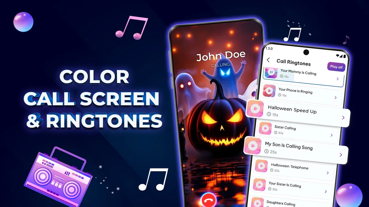
Color Call Screen & Ringtones
- 4.6
- Rating
- 5.00M
- Installs
- Free
- Price

 Analysis by App-foxy
When several people share a home, a phone call is rarely just a private moment. It can be a delivery driver calling while someone else is cooking, a school contact reaching a parent, or an older relative trying to identify the right device quickly. Color Call Screen & Ringtone is a personalization app built around making incoming calls more noticeable through themed call screens, live wallpapers, flash alerts, and ringtones. I found its appeal less in changing the whole phone experience and more in giving each device a clearer visual and audio identity.
The app comes from Creative Apps Studio LTD and is available free of charge, although individual in-app purchases range from $0.99 to $19.99. It is rated for Everyone, which makes the concept easy to understand for a broad household audience. The important distinction is that this is not a family-management tool, a messaging service, or a contact-sharing system. It changes how calls look and sound on the device where it is installed. That boundary matters when deciding whether it fits a shared-device routine.
How it works when a household shares attention between phones
I can imagine using it in a home where multiple phones are often on the same table. If a colorful call screen appears on one device and a selected ringtone plays, it may be easier to recognize whose phone is ringing without picking up every handset. A flash alert can add another signal when the sound is low, while a live wallpaper gives the phone a more personal feel between calls.
You May Also Like

 Blood Strike: 2.5 Anniversary
Blood Strike’s Loadouts Turn Every Drop Into a Tactical Gamble
A close look at Blood Strike’s custom loadouts: how fast access to signature weapons reshapes its battle royale rhythm, rewards preparation, and narrows the gap between fights.

 Pandora - Music & Podcasts
Pandora’s Music Is Easy to Start, but Harder to Recover
Pandora’s strength is its low-effort path from a seed to a station. Its weak spot is how much confidence it asks you to place in connection, setup, and quiet recovery.

 8 Ball Pool
 Is Built on Rivalries, Rematches, and Routine
A close look at the rivalries, rematches, shared routines, and unanswered safety questions that turn a quick pool match into a persistent mobile community.

 Samsung Music
’s Quiet Strength Is Playing What You Already Own
Its reach comes less from spectacle than from dependable access to a personal library. That simplicity is both the app’s strongest retention engine and its ceiling.

 AccuWeather: Weather Radar
AccuWeather Review: A Quick, Clear Forecast for Everyday Decisions
For everyday plans, the best forecast is the one you can understand quickly. AccuWeather makes rain timing, radar, and local conditions easy to act on, with a few trade-offs.

 Hill Climb Racing
Why Hill Climb Racing Still Turns Crashes Into One More Run
A tiny car, a bumpy hill and one more upgrade: Hill Climb Racing keeps resurfacing because its simple chaos makes every near-miss feel personal.
More From Our News Desk



That sounds simple, but the practical benefit depends on how deliberately each person sets up the phone. The app does not turn a group of devices into one coordinated system. Each installation remains tied to the individual phone, and the visual or audio choices are useful only if everyone agrees on a recognizable style. One person might choose a bright theme, another a quieter appearance, and a child’s phone might use a different ringtone. The result is informal coordination rather than centralized control.
In my view, this is where the app makes the most sense: not as a way to manage a household, but as a small identification aid. Suppose a parent is preparing dinner while a child’s phone is charging nearby and a partner’s phone is on the counter. Distinct call screens and sounds can reduce the number of times someone asks, “Whose phone is that?” It is a modest improvement, but it can be useful in busy rooms.
There is also a trade-off. More visible alerts can help someone notice an important call, yet they can make a phone feel busier. A dramatic screen, flashing light, or prominent ringtone may be distracting in a quiet room, during a meal, or when another household member is resting. I would treat these effects as tools to adjust carefully, not features to leave at their most noticeable setting all day.
Personalization is strongest when it has a purpose
The themed call screen is the central attraction. Instead of relying only on the standard incoming-call display, I could give calls a more distinctive visual treatment. That is especially helpful for people who recognize devices by appearance rather than by sound. A live wallpaper extends the same idea beyond incoming calls, making the phone’s background feel less static.
Still, a decorative change is not automatically a practical improvement. If a person wants a minimalist interface, a standard system call screen may be better because it is familiar and less visually demanding. The app is most worthwhile for someone who enjoys expressive phone customization or needs extra cues to distinguish devices. It is not a replacement for the phone’s basic calling functions.
One useful approach is to separate personal taste from household signaling. I would choose the wallpaper because I like seeing it, then select the ringtone and call-screen style based on how easily I need to identify the phone. Mixing those decisions prevents the loudest or brightest option from becoming the default simply because it looks impressive in a preview.
Setting it up without crossing personal boundaries
On a shared device, setup deserves more thought than it would on a phone used by one person. The app changes a visible part of the calling experience, so everyone who regularly uses that phone should know what has been selected. I would avoid installing it on someone else’s device without asking, especially when that person relies on a familiar call layout or needs a quiet notification style.
There is also a clear account boundary to keep in mind. The app personalizes the phone, not the household’s contacts or communication habits. A theme does not tell one person who is calling on another person’s device, and a ringtone does not create permission to answer someone else’s calls. In a family setting, that distinction is healthy: customization can be shared as a conversation, while call privacy remains with the phone’s owner.
For a phone used by several people, I would begin with the least disruptive combination: a recognizable call screen, a moderate ringtone, and no flash alert until there is a real need for it. Then I would test the setup during an ordinary day. Does the owner notice calls? Can other people identify the phone? Does the alert become annoying when the device is left in a common room? These questions are more useful than choosing a theme based only on its appearance.
Another practical tip is to make one change at a time. If the wallpaper, call screen, ringtone, and flash behavior all change together, it becomes difficult to know which part is helpful and which part is irritating. I would first establish the visual style, then adjust sound, and finally consider the flash alert for situations where sound or sight alone is not enough. This gradual method makes the experience easier to reverse.
Coordinating calls without pretending the app manages people
Color Call Screen & Ringtone can support a simple household convention, but it cannot replace communication between household members. For example, a family might agree that one phone uses a particular color family and another uses a different visual style. That agreement can make a ringing device easier to identify from across a room. The app supplies the personalization; the household supplies the meaning.
I would be careful not to turn those visual choices into a false priority system. A striking theme does not mean a call is urgent, and a quiet ringtone does not mean a call is unimportant. If a phone belongs to someone who needs to be reachable, the household should discuss practical habits such as where the device is kept and when it is silenced. The app can make the signal more recognizable, but it does not know which caller matters most.
This is also why the app compares differently with ordinary alternatives. The default phone settings are usually the better choice for someone who wants simplicity, predictable behavior, and fewer layers between the call and the user. Built-in contact customization may be preferable when the goal is assigning specific tones to individual callers rather than changing the overall call presentation. A wallpaper-only app may be enough for someone who cares about appearance but does not want call-related changes.
The advantage here is the combination of several personalization elements in one place: the incoming-call appearance, the background, the ringtone, and the flash alert. That combination can create a more coherent identity for a device. The disadvantage is that a broader set of changes also creates more opportunities for visual clutter, unwanted noise, or a setup that feels excessive compared with the phone’s standard tools.
Age, trust, and choosing the right level of visibility
The Everyone age rating makes the app approachable for general household use, but an age label is not a substitute for supervision or good judgment. A younger user may enjoy a colorful call screen, while an older relative may benefit more from a clear, noticeable alert than from a decorative theme. The right setup depends on the person’s comfort with customization and on how they normally notice incoming calls.
For a child’s phone, I would focus on recognition rather than making the device more entertaining. A distinct but not embarrassing ringtone could help a parent identify it in a shared space. For an older family member, a straightforward visual design and an easy-to-hear sound may be more useful than a busy animated background. In both cases, I would let the device owner participate in the choice rather than treating personalization as something imposed on them.
Trust matters because call presentation is visible to anyone nearby. A household should be comfortable with the selected image, color, and sound before using them in public or at school. A playful style that feels fine at home may be distracting in a classroom, office, clinic, or place of worship. I would keep a more restrained option in mind for phones that move between private and public settings.
The app is also not the right answer for someone looking for parental controls, location tracking, contact approval, or a shared family dashboard. Its purpose is appearance and alert customization. Those needs belong to different tools, and confusing them could lead a household to expect protections this app is not designed to provide.
What to expect from the free version and optional purchases
The app can be installed for free, which makes it easy to try before deciding whether its style suits a particular phone. Optional purchases are priced per item, from $0.99 to $19.99. I would approach those choices slowly, especially on a device used by a child or shared in the household. The sensible test is whether the free experience already solves the practical problem before paying for extra personalization.
For me, the purchase question would depend on the reason for installing the app. If I only wanted a clearer incoming-call identity, I would first see whether the available free choices are enough. If the goal is a very specific visual style, more variety may matter more. Either way, the value is subjective: a paid theme can feel worthwhile to someone who enjoys customizing a phone, but unnecessary to someone satisfied with the standard interface.
The current version is 1.1.7, and the app supports devices running Android 8.0 or later. That makes compatibility worth checking before setting up a household routine, particularly if family members use older phones. I would also test the result on every device separately rather than assuming that one person’s experience will match another’s. Screen size, sound preferences, and everyday usage can make the same customization feel different from phone to phone.
Small details that make the setup more useful
My first concrete recommendation is to use the app as a visual map for devices, not as a collection of random decorations. Give each frequently shared phone a deliberately different identity. The difference does not need to be extreme; a distinct color mood or recognizable style may be enough. This is more effective than choosing the same attractive theme everywhere, because identical designs remove the very distinction the household needs.
Second, treat the flash alert as a situational tool. It may help when a phone is on silent or when the owner has difficulty hearing a ringtone, but it can be disruptive in dark rooms or around people who are sensitive to sudden light. I would enable it only after considering where the phone is normally kept. A feature that is useful in a noisy kitchen may be irritating beside a sleeping person.
Third, review the ringtone in the places where the phone is actually used. A sound that seems pleasant while selecting it may be too sharp in a small room or too subtle in a busy home. I would ask the phone’s owner whether they can recognize it without feeling embarrassed in public. That human reaction is more important than how impressive the option seems during setup.
Fourth, keep a simple fallback in mind. If the customized call screen ever feels confusing or someone in the household dislikes it, returning to the phone’s normal calling presentation may be the best decision. Personalization should reduce friction, not create an argument every time the phone rings. The ability to change course is part of using the app responsibly.
Who will enjoy it, and who should leave it alone?
I think the app suits people who like expressive phone design, want a more recognizable incoming-call experience, or share living spaces where several devices ring at once. It can also be useful for someone who wants more than a wallpaper but does not want to assemble separate tools for the call screen, ringtone, and alert style. The combination is its clearest reason to exist.
I would skip it if I prefer the phone’s original interface, dislike animated or attention-grabbing elements, or need a tool for managing family accounts and communication permissions. It is also a poor fit for a household that expects one installation to coordinate every person’s phone. Each device still needs its own setup and its own agreement about what is appropriate.
The rating of 4.5 from around 8.8 thousand ratings and more than 5 million installs suggests that the concept has reached a substantial audience. I take that as evidence of broad interest rather than a guarantee that every household will enjoy the same style. Personalization apps are unusually dependent on taste, phone habits, and tolerance for extra alerts, so I would still judge it by the experience on the specific device that matters to you.
My household verdict
After looking at it as a shared-device tool rather than only a decorative app, I see Color Call Screen & Ringtone as a useful but limited layer of customization. Its strongest contribution is helping a household give phones distinct visual and audio identities. The live wallpaper adds personality, while the call screen, ringtone, and flash alert can make incoming calls easier to notice in different situations.
Its limits are equally clear. It does not coordinate family members, protect private calls, or decide which alerts deserve attention. It also asks users to balance visibility with quiet, especially when a phone is used around other people. The best results come from choosing settings with the device owner, testing them in real surroundings, and keeping the design recognizable rather than overwhelming.
For a friend who wants a livelier call experience or needs to tell several household phones apart, I would recommend trying the free version first. I would not recommend buying extras immediately, and I would not install it as a substitute for family controls or account management. Used for what it actually does, the app is an approachable personalization option from Creative Apps Studio LTD that can make a phone feel more individual without pretending to solve the larger challenges of shared-device life.
FAQs for Color Call Screen & Ringtones
01What is Color Call Screen & Ringtone and what does it do?
Color Call Screen & Ringtone is an app designed to enhance your incoming call experience by offering vibrant screen themes and customizable ringtones. It allows users to personalize their call screens with various colors and designs, making phone calls more visually appealing and customizable.
02Is Color Call Screen & Ringtone free to use?
The app is free to download, with basic features available at no cost. However, there may be in-app purchases or premium features that require payment. Users can choose to upgrade for additional themes, ringtones, and an ad-free experience, enhancing the app's functionality.
03How do I set up a custom call screen using this app?
To set up a custom call screen, open the app and browse through the available themes. Select your preferred theme and follow the on-screen instructions to apply it. The app will guide you through activating the theme for all incoming calls, adding a personalized touch to your phone.
04Does the app affect battery life or phone performance?
Color Call Screen & Ringtone is designed to be lightweight and efficient, minimizing impact on battery life and phone performance. While using animated themes might slightly increase battery usage, the app itself is optimized to ensure smooth operation without significant drain or slowdowns.
05Is Color Call Screen & Ringtone safe and secure to use?
Yes, the app is safe to use, provided it is downloaded from reputable sources like the Google Play Store or Apple App Store. It adheres to privacy policies, ensuring your personal data is protected. Always keep the app updated to benefit from the latest security patches and improvements.
Pros
- Vibrant themes enhance call experience.
- Custom ringtones personalize each contact.
- User-friendly interface for easy navigation.
- Regular updates with new themes and sounds.
- Low battery consumption for prolonged use.
Cons
- Limited free themes available.
- Ad interruptions in the free version.
- Occasional bugs with theme application.
- Premium features locked behind paywall.
- Some themes may not suit all tastes.

Color Call Screen & Ringtones
Gallery